
Stunning user experience
for your digital product
Delivering a stunning user experience (UX) is at the heart of every successful digital product. From intuitive navigation to seamless interactions, great UX turns complex ideas into simple, engaging, and delightful user journeys. Whether it’s a mobile app, web platform, SaaS product, or enterprise tool, our design approach prioritizes user needs, clarity, and functionality. We combine thoughtful design, usability testing, and modern UI practices to craft experiences that not only look beautiful but also drive engagement, retention, and customer satisfaction.
UX Impact Statistics
88%
of online users are less likely to return to a website after a bad user experience.
70%
of online businesses fail due to poor usability and bad user experience.
94%
of first impressions are design-related, directly impacting user trust and credibility.
85%
of users believe a mobile app should be as good or better than the desktop experience.
Why Building Your Own Dependable Development Team Matters
In the digital world, user experience isn’t just about looks — it’s about how effortlessly users can interact, navigate, and engage with your product. A stunning, intuitive, and thoughtful UX transforms complex processes into seamless journeys that drive satisfaction, loyalty, and growth. Just as a dependable development team accelerates product delivery, great UX accelerates user adoption and retention. It turns visitors into customers and customers into advocates.
ROI Insight
$100
Companies that invest in UX see a return of $100 for every $1 invested, demonstrating how UX directly impacts revenue.

Case studies and proof
Great UX turns complex workflows into obvious, useful experiences — and it measurably improves adoption, retention, and customer satisfaction. Our design engagements span community platforms, e-commerce, recruitment, healthcare, and hardware-backed agritech; each case shows how research-driven design, rigorous usability testing, and design systems reduce friction and increase business metrics. These examples demonstrate practical outcomes: faster task completion, higher conversion, fewer support tickets, and stronger product-market fit driven by thoughtful, repeatable design practice.
_2324x1700.png)
Jujubi
Merchant-centric flows and streamlined shopper journeys that reduce friction in onboarding and checkout.
_2688x1536.png)
Arttora
A discovery-first UX that surfaces relevant collaborations and makes discovery and sharing intuitive for creators.

Seedvision
Simple, error-resistant workflows for field operators to capture images and sync batches reliably in low-connectivity conditions.
_1710x1230.png)
Bubblegum
Lightweight, fast interactions and progressive loading patterns that keep a 100k+ audience engaged.

Medrabbits
Compassionate, accessible interfaces for caregivers and patients that prioritize clarity, reminders, and secure sharing.
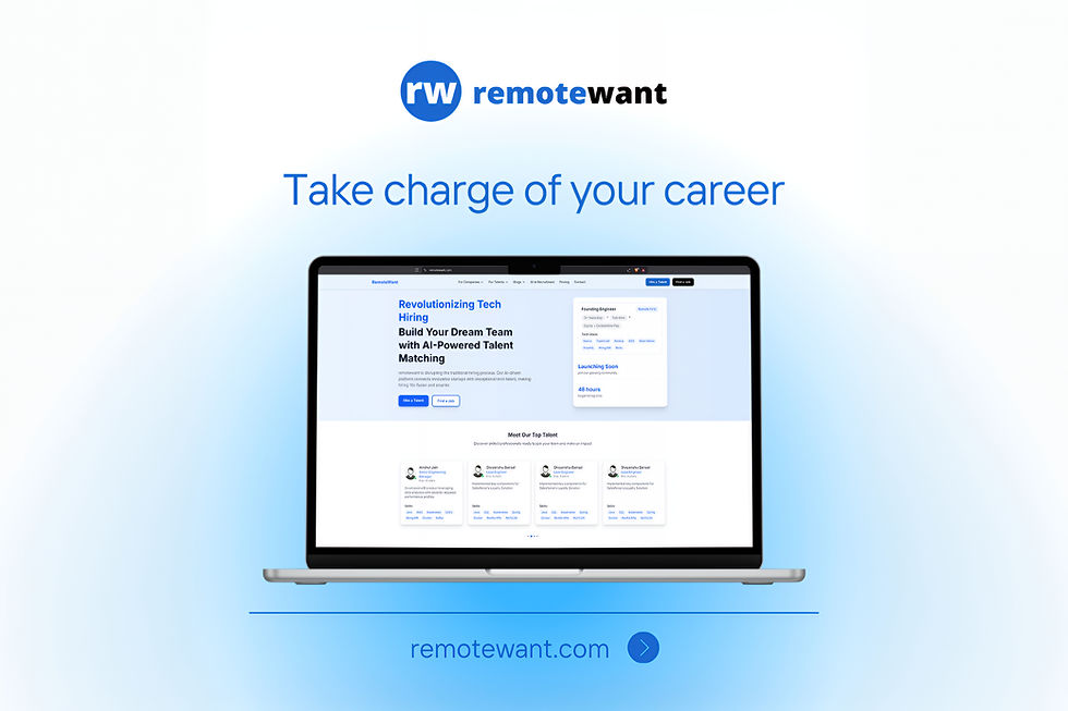
Remotewant
Mobile-first job search and application flows designed to maximize candidate conversions and resume completion.
_1344x768_2688x1536.png)
Thought leadership
Design is a business discipline, not decoration. The highest-impact product teams treat UX as a measurable capability: they define user outcomes, instrument behavior, and iterate designs guided by data. Good product design integrates discovery (research + contextual interviews), rapid prototyping (low-cost validation), and continuous measurement (funnel, activation, retention metrics). That loop — research → prototype → measure → ship → learn — converts subjective “nice to have” changes into reliable improvements in core KPIs. Designers must own outcomes alongside PMs and engineers, with clear success criteria for every release.
Scalability and trust require design systems, governance, and accessibility baked into the workflow. A living design system reduces design debt, ensures visual and interaction consistency, and enables faster experimentation. Equally important is inclusive design: accessibility, localization, and low-bandwidth modes are business features that broaden markets and reduce support load. Finally, design leadership should push for cross-functional rituals — research show & tells, rapid usability checks in CI, and feature-level experiment hypotheses — so design becomes both strategic and operational, not an afterthought.
Product ideas
Product ideas here focus on platformizing design capability: reusable systems, experimentation tools, accessibility toolkits, and interaction libraries that let product teams ship beautiful, consistent, and measurable experiences faster.
Treat the design system as a product: a versioned, governed offering that serves designers and engineers with component libraries, tokens, accessibility rules, and on-brand templates. This product includes a published component repo (React/Vue/Native), a token store (colors, spacing, motion), documentation site with do/don’ts, and a governance model (release cadence, contribution guidelines, and breaking-change policy). It also ships integration kits (storybook, design-tool plugins) and example patterns for common flows (onboarding, payments, search), so teams can assemble experiences without rethinking UI basics each time. Properly run, the design system reduces visual inconsistency, speeds new feature builds, and lowers QA cycles for UI regressions.
Operationalizing the system requires product metrics and support: adoption dashboards (which teams use which components), accessibility coverage reports, and a backlog for new patterns requested by teams. It includes automated visual regression tests, linting rules tied to tokens, and CI hooks that fail builds when off-token styles are introduced. Running the system like a product also means a small cross-functional steward team (designer-engineer, docs owner, accessibility lead) responsible for roadmap, SLAs for support, and change communication. Over time this approach converts design effort into reusable assets, enabling consistent brand expression and faster experimentation across multiple products and platforms.
The Experimentation & UX Hypothesis Engine is designed to bridge the gap between research insights and measurable design action. By ingesting multiple data sources — funnel drop-off analytics, session replays, survey feedback, and usability study results — it automatically generates prioritized UX hypotheses for product teams. These hypotheses are tied to wireframe-level suggestions and recommended KPIs, giving designers and PMs a clear path from problem identification to potential solution. Instead of intuition alone, the system offers structured reasoning for what to test and why, helping teams focus on the highest-impact changes.
Integrated directly with A/B testing and feature flagging platforms, the engine streamlines experimentation. Teams can launch controlled tests, collect data, and attribute causality to specific design changes without redundant setup work. It also consolidates results into a single dashboard that connects experiment outcomes with broader business KPIs like retention, activation, and conversion. Over time, the engine builds a knowledge base of past experiments, reducing repeated mistakes and accelerating organizational learning. This product converts design exploration into a disciplined, measurable process that scales.
The Micro-Interaction & Motion Library provides teams with a curated collection of motion patterns, animations, and interaction effects designed for delight, clarity, and accessibility. Each interaction — whether a button hover, a success confirmation, or a navigation transition — is standardized with implementation-ready presets that balance responsiveness with performance constraints. Designers can select from pre-approved interaction sets that align with brand expression, reducing the inconsistency and engineering overhead of ad-hoc animations. By embedding accessibility presets like reduced-motion options, the library ensures inclusivity for users with motion sensitivities.
Beyond visuals, the library establishes motion as a language of feedback and guidance. Progressive emphasis rules help users focus on critical actions, while subtle animations add emotional resonance without slowing task completion. Documentation provides guidance on when and where to apply interactions, ensuring they enhance usability rather than distract. The system also includes lightweight performance monitoring to safeguard smooth experiences on lower-end devices. Over time, the library evolves into a central design asset: accelerating production speed, elevating brand identity, and enabling thoughtful, accessible micro-interactions at scale.
The Accessibility & Inclusive Design Toolkit equips teams with automated and manual resources to build products that meet WCAG standards and reach diverse user groups. Automated audit scripts run within CI pipelines to detect accessibility violations in layouts, color contrast, ARIA roles, and semantic markup. In parallel, persona-driven checklists guide designers and developers in addressing inclusive scenarios such as low literacy, non-native language users, or low-bandwidth environments. Together, these tools provide both the compliance backbone and the human-centered perspective necessary for inclusive product design.
To support remediation, the toolkit includes playbooks and ready-to-use design patterns that fix common issues — for example, localized iconography, simplified navigation flows, and offline-first behaviors for bandwidth-limited users. It enables teams to prioritize accessibility fixes by severity and impact, ensuring efficient investment in compliance work. The toolkit also generates dashboards that report conformance progress, making accessibility an ongoing tracked metric rather than a one-off task. This combination of automation, patterns, and reporting empowers teams to deliver digital products that are not only legally compliant but also broadly usable and inclusive.
Hardware products paired with apps often fail in the field because of fragmented UX across device and software touchpoints. The Hardware-App Interaction Patterns package solves this by codifying proven workflows for device calibration, guided capture, error recovery, and offline synchronization. It provides UI flows that teach operators how to calibrate sensors, confirm device readiness, and collect accurate data under variable environmental conditions. The patterns also account for real-world friction points — poor connectivity, user errors, or sensor drift — and provide tested UX strategies to mitigate them.
By embedding consistency across device screens, companion apps, and backend sync states, these patterns reduce operational errors and improve trust in the system. Operators gain confidence through step-by-step guides, clear progress indicators, and fallback modes, while product teams reduce support tickets and failed deployments. Documentation includes edge cases and standard error states to ensure predictable behavior across hardware generations. These patterns not only improve user experience but also shorten validation cycles, creating more reliable deployments in high-stakes domains like agritech and industrial IoT.
Solution ideas
Solution ideas are pragmatic implementation patterns for embedding great design into delivery: governance, research pipelines, prototyping infrastructure, accessibility automation, and measurement dashboards that keep UX work fast, auditable, and outcome-focused.
Solution Idea | Detailed Description |
|---|---|
Device + App Interaction Blueprints | For hardware-paired products, provide end-to-end blueprints: device onboarding flows, OTA update UX, failure modes, and sync status patterns that reduce support calls and improve field reliability. |
Journey Mapping + KPI Dashboards | Connect journey maps to telemetry: funnel visualization, drop-off heatmaps, and segment analysis; provide templates linking a UX change to expected KPI uplift and measurement queries. |
Performance-Aware UI Delivery | Enforce bundle splitting, critical CSS inlining, image/post-processing pipeline, and performance budgets tied to UX metrics (Time to Interactive, First Input Delay) to safeguard mobile users and low-bandwidth contexts. |
Accessibility Automation & Remediation Playbook | Integrate automated accessibility scans into CI, produce prioritized remediation lists, and provide a continuous conformance dashboard; include human spot audits and remediation sprints. |
A/B & Feature Flag Integration for UI Experiments | Standardize experiment naming, metric tracking, and guardrails for UI experiments. Provide templates for hypothesis → metric mapping and automated result reporting to eliminate ad-hoc experiment setups. |
Rapid Prototyping Lab | Provide kits (Figma templates, prototyping components, device farms) and integration with user-testing platforms for 1–3 day prototype tests. Include checklist for reach (accessibility, localization) so prototypes are production-aligned. |
UX Research Pipeline | A repeatable research cadence: repository for research artifacts, recruitment templates, moderated usability templates, and a prioritization engine that converts findings into validated design tasks with expected KPIs. |
Design System Governance & Versioning | Establish a steward team, release cadence, semantic versioning for components, and contribution workflow. Include visual regression tests, token enforcement in CI, and an adoption dashboard to measure usage and technical debt. |